Tucked down a leafy street close to the botanic gardens in South Yarra is ‘Park Towers’, a 1938 art deco apartment designed by renowned inter-war architect Arthur Plaisted. Considered one of his most significant works, the two towers that give the building its name are separated by a central walkway, offering each apartment leafy views and plenty of natural light. With just 18 apartments in the complex, the top-floor apartment of our clients Bruce and Ange had an abundance of potential, with its serene outlook and beautiful art deco bones.
Bruce and Ange knew the promise of the apartment needed to be unlocked, and with their daughter Grace working in sustainability, they were drawn to the ethos of Brave New Eco. With a dated renovation from the 1960s to the kitchen and bathroom, the apartment still retained its original hardwood floors, a generous curved balcony with large windows, and the archetypal art deco fireplace.
The twin objectives of this project were to extensively update the kitchen and bathroom, preserving and elevating the original features alongside complimentary modern aesthetics. The second intention was to introduce practical solutions to integrate new appliances, create more storage, and reconfigure the functionality of the space.
Each project brings a unique set of challenges, and this one was no different. Firstly, we needed to achieve the end result without changing any of the internal walls which were all structural. And did we mention that this top-floor apartment was in a building with no elevator, meaning everything needed to be carried up the external staircase by hand? Our builders did not need to visit the gym for the duration of this project!
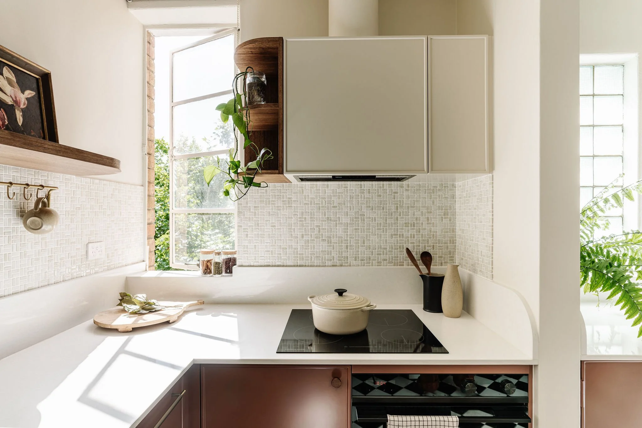
The kitchen in particular was small and awkward, and had to function as a place for meals as well as the housing a euro laundry. We removed the double doors that opened into the kitchen from the hallway and reconfigured the layout of the kitchen work zones to reveal a glass block window that a fridge had previously covered up, flooding the new kitchen with natural light.
Two-tone joinery conceals integrated appliances such as the fridge, dishwasher and washing machine, cutting out much of the visual clutter. Separating the colours of the joinery so the lower portion of the cabinetry is warm earth shade, while above the benchtop blends with the neutral cream of the wall colour, keeping the space light and open.
We chose to keep and repair the existing checkerboard tiles in the kitchen that were the best part of the 1960s renovation, reusing not-needed tiles to patch and replace any broken ones. To elevate the original features of the apartment and reduce disparate elements, we repeated an existing curved arch shape (found in the entry/hallway) to a square arch in the kitchen.
Curved open shelving in timber joinery adds storage without closing off space to the eye, and curves are again repeated on the vertical return of the benchtop.
The shallow space behind the front door provided the perfect spot for a full wall of shelving, and storage. A curved dining table has been designed to drop down when not in use.
In rearranging the bathroom, we concealed plumbing in a built-out wall to provide a storage ledge, and a bath was removed and replaced with a generous shower.
Although planned in advance, much of the design had to be finalised on-site due to the age and construction of the building. This could have presented major challenges, however luckily (or call it designer intuition), during the demolition of the bathroom it was revealed that there had previously been two layers of floor tiles, which gave us a tiny bit more height so that we could incorporate an in-wall cistern for the toilet and remove the planned 100mm hob (little step) into the shower. The result is a functional little bathroom that feels much bigger than it is.
The original stuccoed walls were redone by a plaster artisan and have become one of our favourite textural elements of the project. A repurposed dressing table mirror hangs next to a ceramic honey wall lamp by Coco flip.
Contemporary adaptions of art deco signature elements are referenced throughout the apartment in sculptural curves, niches and simple geometric shapes.
We invested in sustainable and durable materials that are set to become richer over time, including antique brass fixtures to tie in with the existing brass door hardware. We took our colour inspiration from the building details- original tiling and colours in the stairwells; staining the timber joinery a rich tobacco and using jade tiles directly reference the original Art Deco tiles. Recurring timber joinery touches, handmade brass accents and soft neutral cream on the walls provide cohesion throughout the apartment.
Tiny mosaic tiles on the splashback allowed us to wrap tiling into the deep reveals provided by the solid masonry walls.
Special thanks to our builder and tiler Paul and his joiner Charlie who worked through some of the finer details were expertly realised. Renovated 85 years after it was first built, the interior of this home is now perfectly resolved, timeless and practical, designed to endure and be loved and lived in for another 85 years.
SUSTAINABLE DESIGN AND ENERGY EFFICIENCY FEATURES
As with all Brave New Eco designs, energy-efficient upgrades and sustainable solutions have been selected.
Minimal intervention design - no relocations or removal of walls.
Recycling and reusing floor tiles in the kitchen
Energy and water-efficient appliances
Using clients existing appliances
Using locally designed and made lighting
Solid brass fixtures and fittings
CREDITS
LOCATION: South Yarra, on the Traditional lands of the Bunurong Boon Wurrung and Wurundjeri Woi-wurrung peoples
SCOPE: Renovation to kitchen & bathroom
CONCEPT + INTERIOR DESIGN TEAM: Megan Norgate, Laura Green
BUILDER: Elevate Bathrooms & Kitchens
CABINETMAKER: Fineline Cabinets
PHOTOGRAPHER: Marnie Hawson
STYLIST: Brave New Eco
COMPLETION DATE: December 2022


