brave new eco styling

APARTMENT LIFE by megan norgate

brave new eco sustainable interior design megan norgate

This apartment for professional business coach Ange and Bodie her dog, was one of a boutique development in Port Melbourne with original high quality interior fit-out by Hecker Guthrie. We were engaged to personalise the storage and joinery for Ange's needs and help furnish the space, plus provide a plantscaping package. Existing exposed concrete ceilings, white paint, concrete, marble and washed-out American oak timber joinery detailing provided a pleasing base palette to work from. To ensure cohesion we worked with this existing 'feminine industrial' material palette enhancing the original features rather than diluting them. We started with a kitchen joinery unit - made to fit onto the original kitchen, yet reading as a distinct form. This joinery storage and shelving had to straddle both the functional needs of the kitchen yet sit comfortably with dining room furniture. Built by Auld designs, the American oak veneer unit was carefully oiled with non-toxic Osmo oils. Locally crafted MadeMeasure leather cabinet tabs were perfectly toned in the space. We replaced the kitchen wall light with a handmade Anchor ceramics wall light in dove grey, to match the existing grey-blue range-hood. This we mounted on a timber plinth, adding extra timber detailing and casting the light right where it was needed in the work zone. 

brave new eco sustainable interior design megan norgate

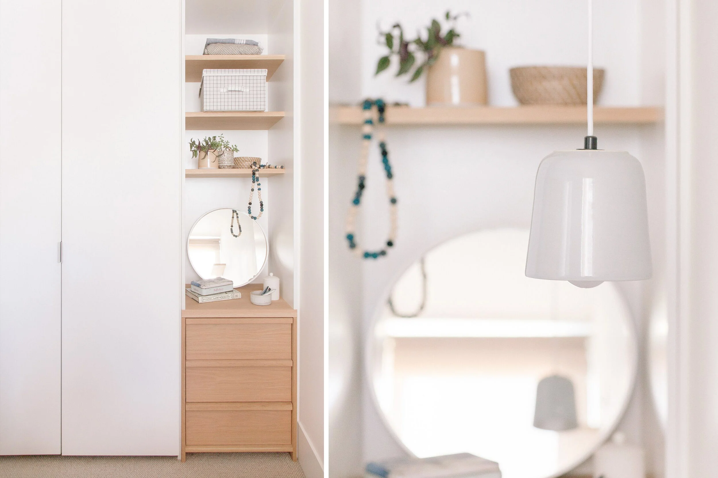
The master bedroom was too small for anything else other than a queen bed and one bedside, and the resulting feeling was a 'bed in a box' with little visual interest around the bed. We solved this by removing one of the built-in wardrobes and installing a custom drawer unit and open shelving above. This little nook articulates the small space, creating an opportunity for display and the drawers provide more useful storage than cupboards. We designed a floating bedside table that maximised floor space and added a hanging bedside lamp from Anchor Ceramics on the other side to remove the need for a second bedside. A wall mounted shelf provided a platform for vertical interest. 

brave new eco sustainable interior design megan norgate

In the second bedroom (which triples as a study, a yoga room, and a guest bedroom) we removed a double door wardrobe and built a desk into the alcove, meaning the floor space could remain clear for yoga sessions and be easy to adapt with a fold out queen bed for guests. Allergic to waste as we are - we recycled all the removed cupboards and light fittings into another project.

brave new eco sustainable interior design megan norgate


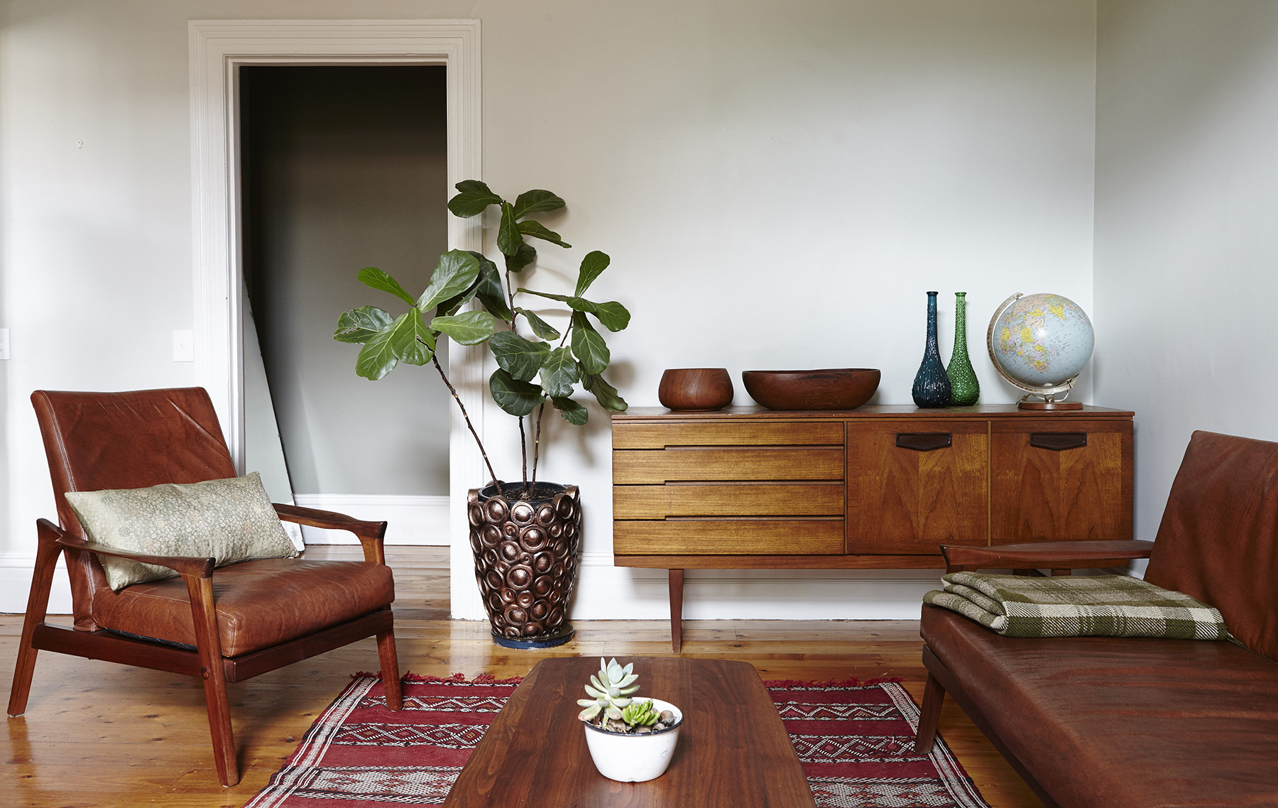
Finally we sourced a few key decorative items and furnishings and supplied a comprehensive plantscaping package, choosing low maintenance house plants appropriate to each space's light levels and optimising the number of plants to the space for air purification. The outcome is a compact apartment yet rich in texture: simple, yet warm and calming. 

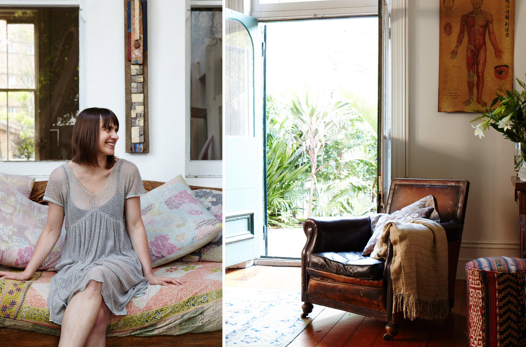
I met with the owner the other day and she told me that she had not bothered to make any holiday plans for the summer as she loved being in her home so much. In her words "The greenery in my space is gorgeous and has totally improved the feeling of my place....My home is a total sanctuary.. easy to live and work in, a total delight". 


All photographs by Emma Byrnes.

BUNGALOW UPCYCLE by megan norgate

14highres_westgate-23.jpg

We first visited this 1950's cream brick bungalow on a generous 800sqm block back in 2013 for a sustainable design consultation. At the time the house had an overwhelming list of issues to be resolved, it was in disrepair, dim, dated, and freezing in winter. Most confoundedly, in the 1970's, a self-contained granny-flat had been built only 4 metres from the back of the house. This addition made both buildings feel hemmed in and blocked the home's connection to the generous garden. With a south facing backyard, the home lacked in northern sunlight. To the owner's dismay, the design professionals they had met with so far had lumped it in the 'too hard' basket advising them to demolish both buildings and subdivide the block into townhouses. Such is the fate of many period homes on large parcels of land close to the CBD! The clients loved the deco style charm of the cream brick, and despite the unfortunate configuration, wanted to make the most of the considerable resources contained in two substantial and solid brick buildings with hardwood features.

brave new eco megan norgate sustainable interior design emma byrnes

Our design concept was to turn the problem on its head and make it the solution. We proposed that rather than demolishing the granny-flat and building an extension, we keep the entire footprint of both buildings and consolidate them to create one large, unified, ecologically sustainable home. This design was resourceful both materially and financially by drastically minimising the amount of new build required instead capitalising on the scope of the existing structures. We suggested an approach based on maintaining the charming original features of the principal building and upgrading the rear buildings interiors and thermal envelope extensively so that they read like new spaces. This project required a lot of imagination and a willingness of the owners to do something unconventional. To our delight, they embraced the idea wholeheartedly.

The buildings needed a total reconfiguration, refurbishment and thermally efficient retrofit. During this process, we were able to solve many diverse problems at once. We provided access to all day winter sun to daytime living areas, by placing them in the rear building. The design created a functional layout and abundant visual and physical connection to the garden. We collaborated with building designer Logan Shield to design structural upgrades to replace a substandard lean two passage currently connecting joining the main house and minor dwelling to function as a sitting room and sun trap. A new cathedral roof to the rear building allowed for the addition of north-facing clerestory windows. 

brave new eco megan norgate sustainable interior design emma byrnes

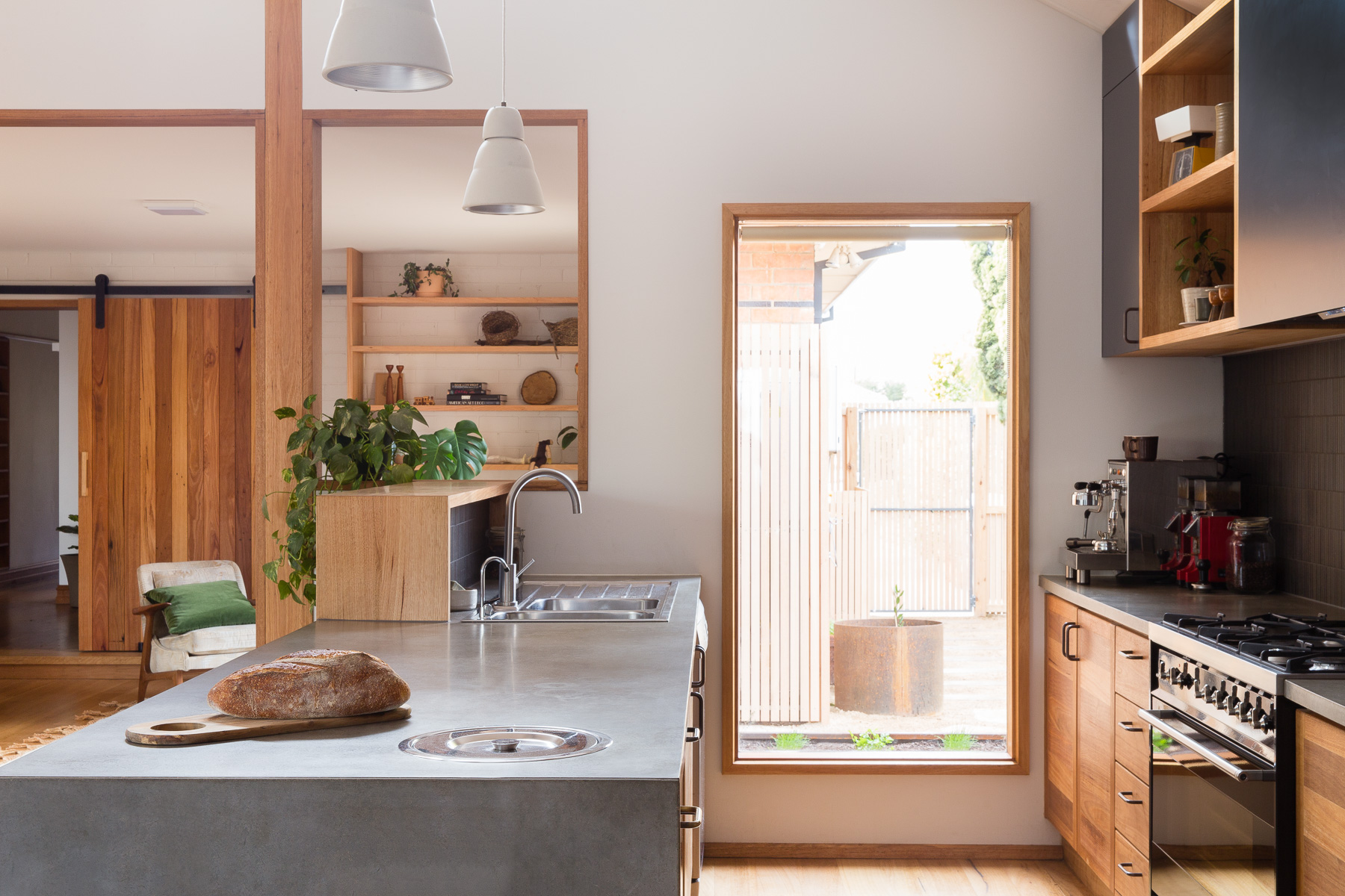
Vintage danish metal pendants were used in the kitchen along with led strip lighting under cabinets. Locally made lights were used by Giffin Design and Anna Charlesworth. Up/ down LED wall-lights were used throughout to allow for ceiling fans.

brave new eco megan norgate sustainable interior design

Creating a visual and practical connection from the residence to the rear garden was prioritised, sliding doors were added to the east courtyard and west decking- making the most of the generous productive gardens. The existing window openings were used to avoid the need for patching of exterior brick-work and the windows upgraded to high performance timber-framed double glazed models. West and south facing windows were reduced and north facing glazing increased. Flexible use of the spaces includes the potential work from home scenarios. Maximising the thermal efficiency of the buildings and upgrading to sustainable technologies involved rainwater tanks, photovoltaic systems and solar hot water. We updated the heating to two zoned efficient space heater systems and added ceiling fans. 

brave new eco megan norgate
brave new eco megan norgate sustainable interior design

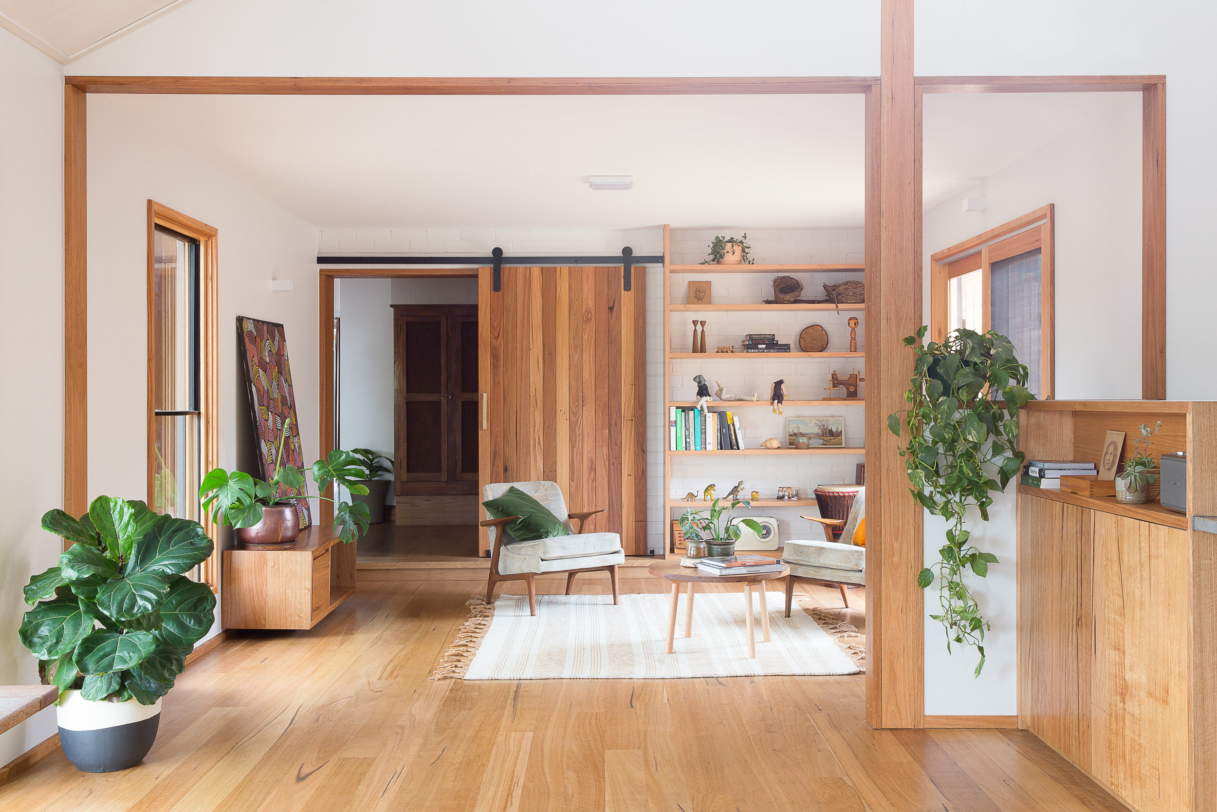
Designed in collaboration with Geometrica, an exceedingly simple timber clad structure formed the new sitting room that would slide in under the eaves and require minimal built alterations to integrate with the existing rooflines. This room opens onto outdoor living spaces to the east and west allowing the owners to follow all day sun and providing cooling ventilation. Early on we envisioned a space for reading and morning coffee and bobby coffee table and pampa rug from Pop and Scott made this space come together. 

brave new eco megan norgate sustainable interior design

The new living areas are separated from the rest of the home by a beautiful barn-style blackbutt timber door that was handmade onsite. Providing the heat zone separation, this also slides away when not in use, tucked neatly against the shelving like a feature wall panel.

brave new eco megan norgate sustainable interior design
westgate_composite09.jpg

The old granny flat is now unrecognisable- entirely transformed into a warm, light, open plan, living/dining and kitchen plus a new laundry/ mud/ drying room and second bathroom. We carefully selected classically appealing details that do not reproduce the mid-century period style but instead provide a contemporary interpretation of it, building a cohesive relationship between old and new. The existing Australian hardwood detailing (Blackbutt) was continued throughout the new spaces to minimise any jarring transitions. Door and window hardware is consistent in aged brass.

brave new eco megan norgate sustainable interior design

We sourced and repurposed salvaged timber railway lockers and fluted glass doors.  A combination of vintage and locally made custom furnishings was used to create a timeless mix of style and form - unified by quality and materiality.

brave new eco megan norgate sustainable interior design emma byrnes

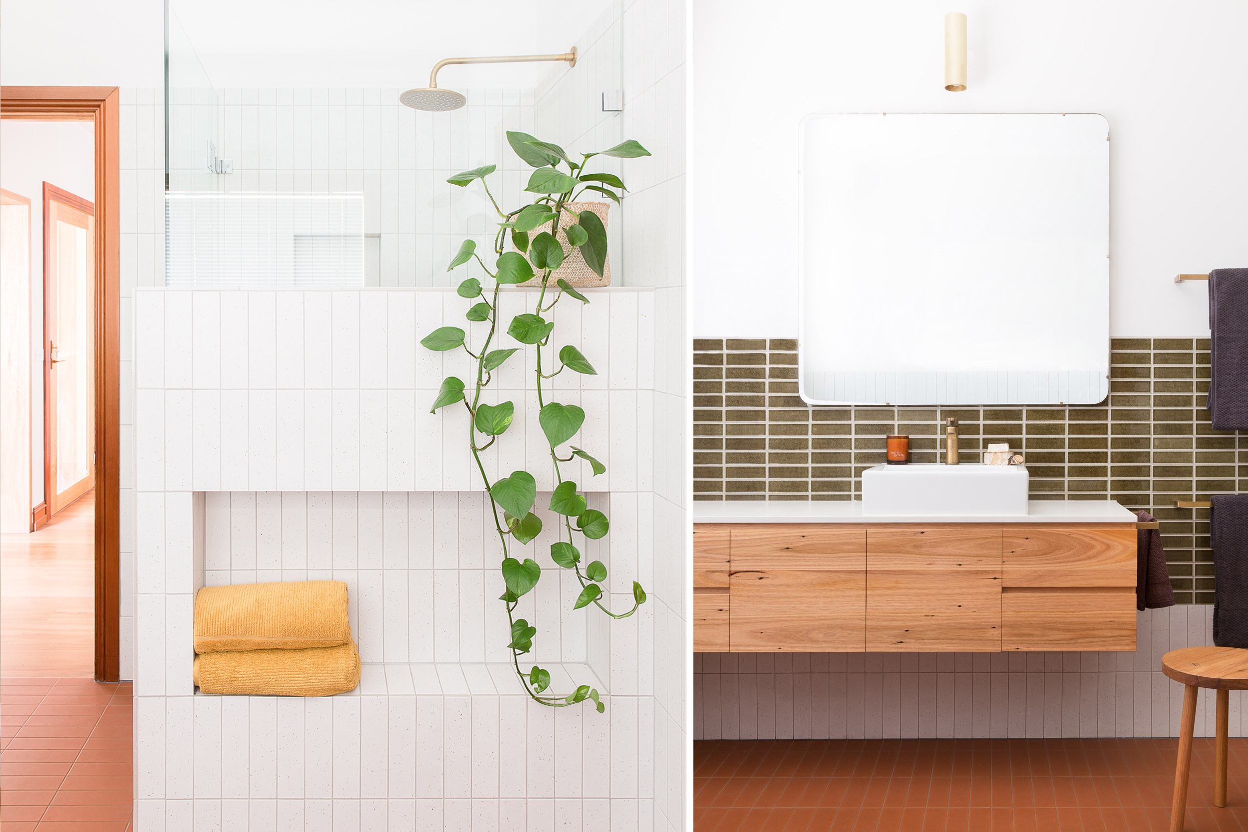
The colour palette draws on earthy deep textures and colours reminiscent of the late mid-century period 1950-1970. A neutral base of white, charcoal, warm blacks and concrete is warmed up with varying shades of warm tones come from timber, terracotta, brass and treacle-coloured tiles. Accents in deep green provide contrast. Surface materials create textural interest, with the existing exterior brick creating a new internal wall, slim plantation timber lining boards to the cathedral ceiling, mosaic tiling, raw terracotta and recycled composite surfaces. We considered durability and practical function in each space with a place for everything and robust surfaces that will age well with use.


westgate_composite04.jpg

All photographs by Emma Byrnes

PRESTON HAPPY by megan norgate

megan norgate sustainable interior design

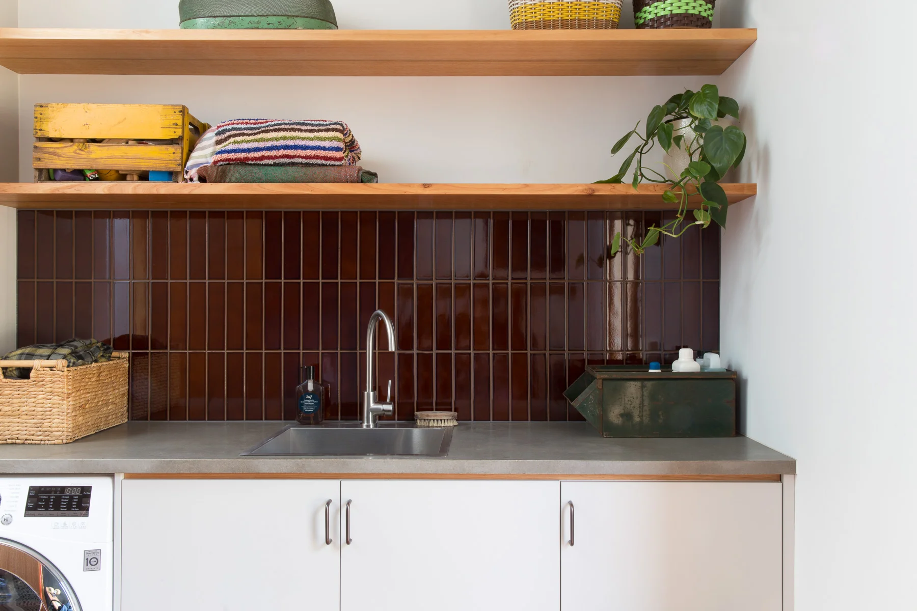
Preston happy was completed in 2015 and was one of our few heroic-owner-builder jobs. When the clients came to us they had already gutted the back of the house and removed their kitchen. Then having the realisation it should probably not go back where it was and that they needed some help to design a new one! It's not our normal style to jump in at that stage of proceedings and churn out a design as quick as we can, as we are great believers in the value of methodical processes and slow design, however after meeting this lovely family and seeing the potential of this modest project we could not resist. This family of five were looking to make their living spaces more functional without adding any space only their originally sized bungalow, simplicity and resourcefulness were key to contain both the complexity and budget. In this case, the lean-to back of the house that often gets removed in favour of new large living areas, stayed. The kitchen we decided to tuck into where the laundry previously was, looking onto the back garden opened up to a dining and sitting.  New double glazed doors and windows in this area improved views and natural light. The kitchen footprint was tiny and complicated, with structural walls creating awkward alcoves, so we designed cabinetry that made sense of the space. Our main objective in the small 6m2 space was to make it user-friendly for a growing family. This was done by creating second workspace alcove in between the pantry and fridge where drinks and snacks could be prepared without having to get in the way of the person cooking or doing dishes. The sink was put in an oversized island bench, deep enough for kids to spread out homework or eat meals on one side while kitchen prep. Over head cupboards were taken to the ceiling provide extra storage space.  The kitchen was made in a low-cost materials, white laminate with plywood trims, and a small amount of hardwood feature shelving. Custom timber handles were made for the pantry to match, with matt textured japanese mosaic tiles for the splashback. Vintage metal pendant lights in yellow and blue were sourced on etsy and added some colour and fun to the kitchen and dining space. A softer shade of silvery blue in natural linen was used for thermally lined curtains. A hardwood built in seat was added to the end of the dining room with storage inside. The laundry was fitted into the hallway to the bathroom, again using storage to the ceiling and designed to have a curtain pull across the work-zone when not in use. The bathroom fixtures were kept in the same place to save money but it was completely transformed through new paint, tiles, toilet and tapware, and we sourced a lovely second-hand Australian hardwood hall table repurposed as a vanity. Inexpensive pool tiles were used in small quantities for the splash back. Vintage porcelain handles were sourced from etsy for the unit and a matching timber base created for a Volker haug wall light. New paint and window furnishings have created a supremely pretty and cheerful home to be in, not to big, not to fussy, just enough. 

And here is what the client had to say:
"It was great to work with Megan, who has such expertise in her field. She enabled us to simplify many of the decision-making considerations of the project. We are very happy with the final outcome. We love the freshness, the incorporation of natural materials, the colours and the beautiful details of recycled timber shelving in the kitchen (integrating it into the angled roof line and making a feature of it). The space is very functional and working really smoothly, especially the compact kitchen. Megan sourced a lovely piece of furniture for the bathroom vanity that adds such warmth to the space. The lighting is a real feature of the renovated spaces. Megan's suggestions have really enhanced the ambiance of the rooms."

megan norgate brave new eco sustainable interior design
megan norgate sustainable interior design
megan norgate brave new eco sustainable interior design

All photographs by Emma Byrnes.

LOVELY LAURA PROJECT by megan norgate

megan norgate brave new eco sustainable interior design

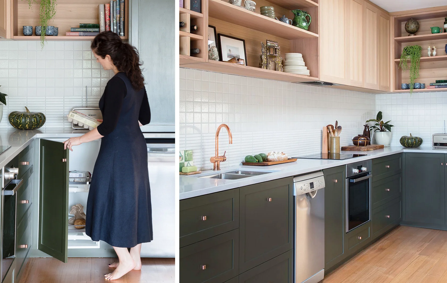
Nestled in the back streets of Brunswick is this sweet single-fronted terrace. BNE were engaged to design a new kitchen for the home- with a brief to create a super-efficient kitchen-for-one - with a small dishwasher, no gas and a only a bar fridge supplemented with a cool store corner pantry.
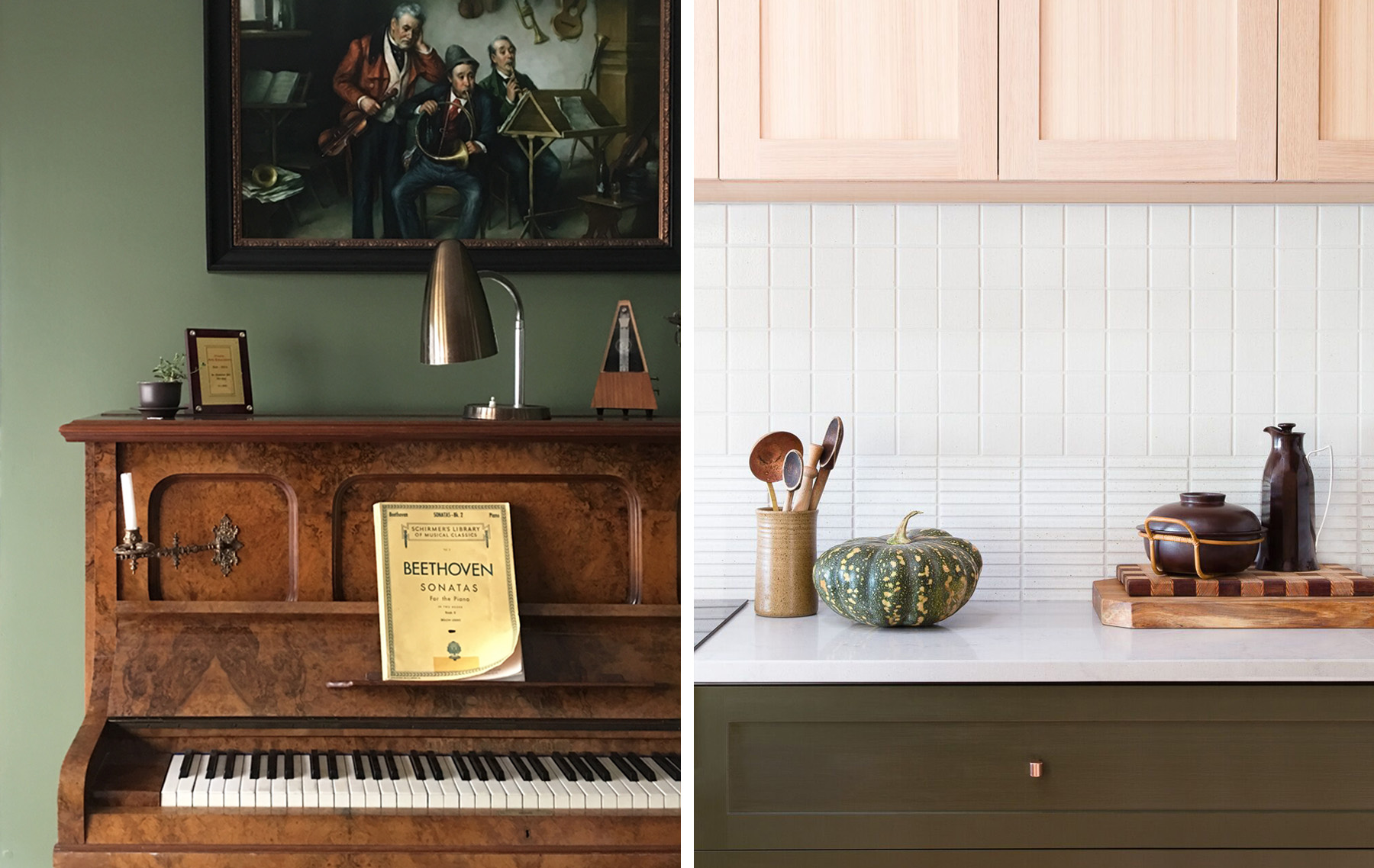
At the centre of the home is a beautiful deep green music room that flows onto the galley-style kitchen. This music room is a serene, and classically elegant space, so the kitchen was designed to reflect the same refined and timeless quality in a lighter and softer way. 

megan norgate brave new eco

Induction cooking was used to remove the house entirely from gas reliance. This allowed the meter to be removed and the owner to convert the house to 100% renewable energy via a solar system and 100% green power.  A full-size fridge was donated to charity and replaced with a small under-bench fridge. The exterior ventilated corner pantry rack houses many perishables that only need to be kept cool, not cold, such as vegetables, fruit, bread and eggs.

megan norgate brave new eco sustainable interior design

The cabinets were hand painted in water based paint - an important feature as they can be repainted instead of being replaced if the owner ever tires of green (never!). Un-lacquered copper cabinet handles and tap-ware were used for their natural microbial qualities.
Australian hardwood shelving was sealed with Osmo oils, and two formats of Japanese tiles were used to create the splashback. 

megan norgate sustainable interior design

Photographs by Emma Byrnes.

BNE FRIENDS: TRIANGLE TERRRACE by megan norgate

alice grant triangle terrace

The owner of this deliciously quirky triangle terrace lived and worked for 20 years between New Zealand, London and Australia before moving back to Australia to create a home for herself. The house would leave most people scratching their heads as to how to make it work. Wrapped around a central courtyard it is built to the boundary on three sides between another terrace, the street and a bluestone laneway angled at 45 degrees away from the street. The resulting building is full of unusually shaped spaces with two tiny triangle rooms at opposing apexes. Rooms follow on from one another, the bathroom, laundry and spare room are through the master bedroom.
Alice enlisted the skills of Nicola at Drawing Room Architecture to resolve the functionality of the spaces and design the new bathrooms and laundry, cosmetic renovation and a courtyard fit-out. She applied her project management skills as a TVC producer with gusto - managing the renovation in a harrowing timeline with a baby on the way.
The modest but transformative renovation ensured every space was carefully considered to centre around the courtyard garden and for life with a young son. The previously dark and masculine spaces were softened with new tiles and paint colours.  Last year, Megan of Brave New Eco had the pleasure of styling the home for a shoot with Australian born, UK based photographer Penny Wincer.

alice grant triangle terrace

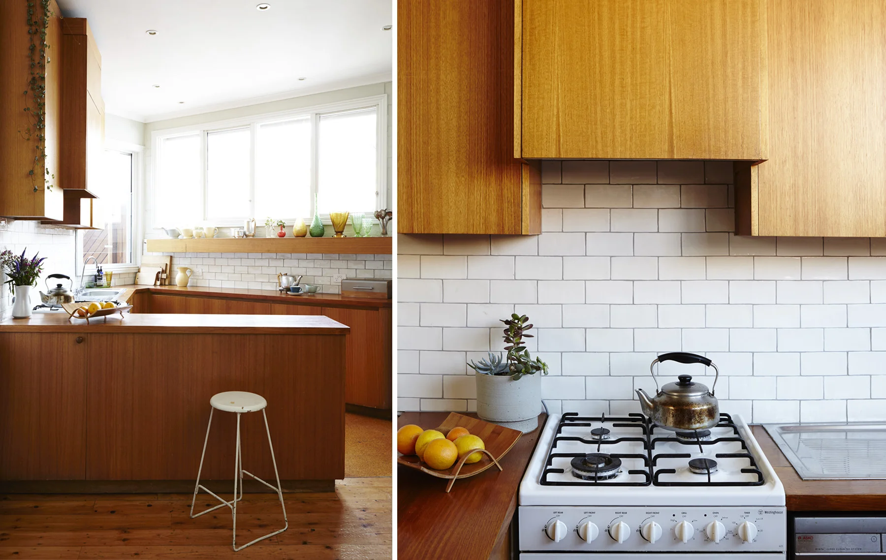
The triangle kitchen is our favourite part of this house. Surprisingly functional for such an awkward shape, the timber cabinetry is the original 1970's fit out. 
New tiles and openable windows were added for cross-flow ventilation. A collection of Alice's iconic NZ Crown Lyn pottery lines the shelf above the window and Alice's collection of teapots get a good workout in this lovely space. 

alice grant triangle terrace
Designed by Nicola from Drawing Room Architecture, The west facing outdoor courtyard features built-in seating and garden beds, a beautiful tall slatted fence and oversized gate and a shady pergola to protect from the hot summer sun. Alice fill…

Designed by Nicola from Drawing Room Architecture, The west facing outdoor courtyard features built-in seating and garden beds, a beautiful tall slatted fence and oversized gate and a shady pergola to protect from the hot summer sun. Alice filled the space with a table tiled in vintage Art Deco tiles, a huge range of plants, mirrors and shelves to vertical surfaces. 

alice grant triangle terrace
triangle terrace
alice grant triangle terrace

An interior palette of rinsed-out early 20th century tones chosen by Nicola was used, to soften the classic spaces and create a classic backdrop to Alice's eclectic furnishings. Vintage light fittings were installed throughout and Alice has furnished the home lovingly with her collection of vintage English and New Zealand objects and furniture. Brave New Eco made some lovely linen curtains trimmed with a vintage Japanese obi.
Alice is an intuitive and disciplined collector, and the home is filled with delightful vintage pieces from her native New Zealand, and Australia and England. She takes a considered approach and really adheres to the William Morris idea that we should only have things in our homes that we find to be useful or consider to be beautiful. The result is a unique and cohesive space, full of humble charm and interest. 

alice grant triangle terrace
A teeny-tiny bathroom/ laundry and toilet were reconfigured by Nicola, making them functional despite the spatial challenges, graphic detail in the vanity and tiles adding interest. Trims and mouldings were painted white to contrast with the timber …

A teeny-tiny bathroom/ laundry and toilet were reconfigured by Nicola, making them functional despite the spatial challenges, graphic detail in the vanity and tiles adding interest. Trims and mouldings were painted white to contrast with the timber floors and provide cohesion. 


BNE FRIENDS- KINGS CROSS RAMBLER by megan norgate

brave new eco styling

Here at Brave New Eco we have a particular affection for old houses in need of some love. There is something about the act of custodianship of an old building, especially one that is under-appreciated, that we feel compelled by. Only certain people will take on a loving rehabilitation of a lame home knowing it will become a bottomless pit for time and resources - it takes a very optimistic and imaginative personality. I thought we would share the story of one such house, originally styled and written by Megan and photographed by Penny Wincer for UK Homes and Antiques magazine. 

Five years ago, creative Sydney couple Rani Chaleyer and Rupert Glasson were considered crazy by their friends and family for buying ‘Barncleuth’ - an abandoned and derelict Victorian Italianate mansion, located on the edge of Sydney’s notoriously seedy but rapidly gentrifying Kings Cross. The building had fallen into a state of disrepair. Together, on a shoestring budget and in record time, they have restored and transformed the faded beauty to create a unique home - vibrant and robust enough for busy family life.

brave new eco styling
brave new eco
brave new eco styling

When Rani first saw the house on the internet she was intrigued as to how such a substantial property, (a set of two semi-detached three-storey Victorian houses in an inner-urban location), could have been left empty so long. The building had been a backpacker’s known as ‘The Pink House’ – reviewed as "the worst backpackers in the world” for its filth and rodent populations. Eventually shutting down, Barncleuth was left empty and inhabited with a transient population of squatters.

When she arrived to inspect the property the real estate agent initially refused to let her inside with her then 5-year-old daughter. Eventually she convinced him to let them look at just a few rooms. It took only those few rooms for Rani to see the vast potential beneath apparent dereliction. The house had 4-metre high ceilings, opposing windows in each room, filigree balconies and a glorious central staircase between three levels of dramatically proportioned spaces. This was a once-in-a-lifetime opportunity and they moved quickly to purchase the pair with another family member.

brave new eco styling

With a third child on the way, the demolition and restoration process began immediately - removing partition walls and bathroom stalls left by the backpackers. A tiny kitchen and laundry was opened up to create a large kitchen leading onto a courtyard. What was left of the modest budget was used for the simplest of renovations - polishing floorboards and painting. The transformation was immediate and dramatic, revealing the inherent proportional beauty and period details of the interiors. With new bathrooms and a simple industrial kitchen, some half-hearted patching and repairs, the home was a new modest version of its previous grandeur.

One of the immediate joys for Rani was to be able to provide a worthy setting for the family heirlooms passed down through her mother’s side of the family:
“Luckily I come from a great line of people obsessed with old things. I grew up with very strong memories of my grandparent's and mother's houses being filled with antiques and curiosities. So it was very exciting for me to be in a space that lent itself to that aesthetic. Some of the things I took to the house that I had grown up with were very special."

brave new eco styling

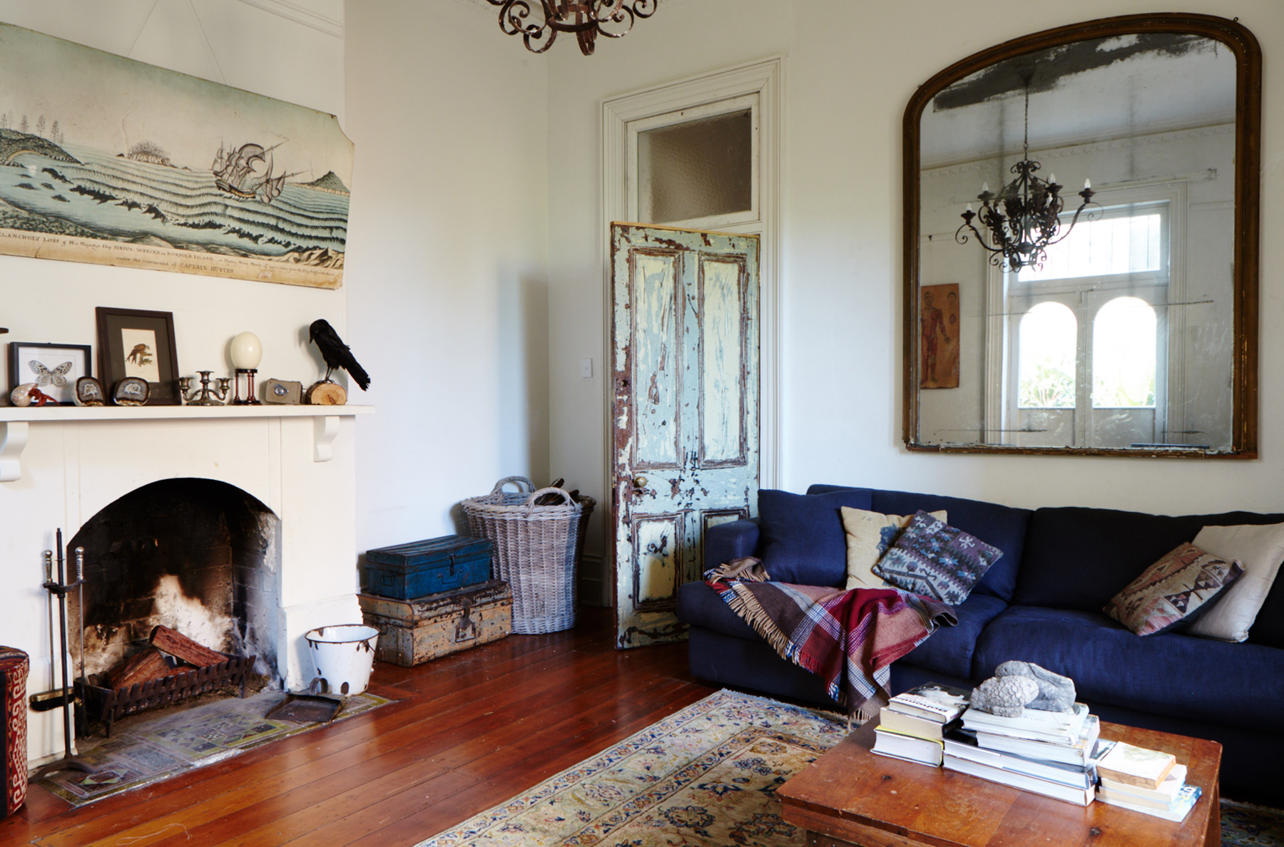
The home has been filled with industrial and antique furnishings bought both online and at various small stores and markets in Sydney, those more likely to carry the rustic, unrestored items Rani prefers. Rani spent many hours scouring Gumtree, where she has picked up oversized 19th and 20th century antiques from sellers without space just wanting them off their hands.

Her eclectic style is unified by an absence of polish. Everything is faded and worn, yet robust beneath patinered surfaces:
“The worst thing to me is something polished. Industrial pieces create a more utilitarian feel and a simplicity that balances some of the more ornate items. I think it comes from my childhood of growing up in eclectic spaces where everything has an imperfection or rawness and that’s the element that unites it all together."

brave new eco styling

Rani’s collections of objects reflect a strong sense of nostalgia, wonder and macabre curiosity. Collections of taxidermy insects, butterflies, shells, bones, old photo’s scientific and educational ephemera grace the cabinets and mantelpieces:
“When I was little, my father would take me to the museum to see the taxidermy exhibitions, I have always had a natural history fascination and have loved the uncanny nature of the world of curiosities, biological specimens and Victorian dioramas."

brave new eco styling

For Rani and Rupert the damaged state they found the home in was one of the qualities that appealed to them - a space that children would not need to be too careful in. The house is an ongoing project and a more substantial kitchen renovation is up next. This ever-changing landscape suits the growing family's lifestyle as a revolving door of local and international visitors use the home as a Sydney base. Large groups of children and adults are regularly entertained, having had created a home with a comfortable balance between utility and beauty.
“We love to fill our house with people, the house is not at all precious or formal, it just absorbs small children and everything in here is robust enough to withstand some boisterous activity”, says Rani.

NORTHCOTE RAMBLER by megan norgate

brave new eco sustainable interior design

This grand old dame is an original Victorian mansion farm house that, once upon a time, sat on ten acres of Northcote farmland stretching down the hill to the Merri creek. Now she resides on a built up Northcote street and is the beautiful quirky home of a creative family - full of nooks and crannies, stairwells, attics, light-wells, alcoves and beautiful art and objects.  

The clients engaged Brave New Eco to help them create a Kitchen-to-Garden design, including a productive permaculture garden, as they wanted to feel more connected to their outdoors spaces. The Victorian design faced inwards on itself and lacked connection to the outdoors. Landscaping is underway and in the meantime the kitchen refurbishment has been completed. 

The country-style kitchen with a beautiful original cream AGA stove and big central table was charming and is the centre of the family life. Unfortunately the tired early 80's 'country style' kitchen had become totally dysfunctional for a family whose kitchen activities include sprouting, baking, socialising and working.
The family wanted "...to keep the essence of our country style kitchen but bring the look and functionality into the 21st century, to declutter and use space better, and to create more pantry space." They were keen not to just rip it all out and start again, but wanted to retain the overall atmosphere and make it functional for the task of family life for another 30 years. The home is full of diverse influences and the family's love of Japanese ceramics and objects was used as in influence to create a unique kitchen design - warm, inviting and full of deep earthy tones all with splashes of bright colour. 

brave new eco sustainable interior design

The kitchen cabinetry was falling apart in places, cluttered and non- intuitive. A lack of pantry space meant food items were stacking up on every shelf and surface plus the old oven and range-hood were not keeping up with this family's' cooking habits.
However the existing cabinets and open shelving were good quality - made from Australian hardwood. So rather than throwing them away completely we decided to rejuvenate the shelving and cabinets. We removed and repainted the lower cabinets with a hand brushed Porters paint, allowing the texture of the woodgrain to show through. We removed fussy cornicing details and added Japanese-style slatted timber doors to create more pantry storage out of sight to the timber box shelving. We kept the old AGA as the centrepiece of the kitchen and added a new in-built steel steam oven and Smeg cooktop.  A new rangehood was concealed in a cabinet and new hardwood shelves run the length of the bench. We re-made the water-damaged cabinetry around the sink - adding waste-sorting systems, a recessed compost bin and integrating the dishwasher. A new pantry was added housing a bright grass green interior and handmade timber door-mounted shelves.  

brave new eco sustainable interior design

An antique Japanese tea chest was found in which to keep stationary and all those bits and bobs. We upgraded all the lighting adding LED spot and strip lights and chose hand-glazed tiles, beautiful utilitarian aged brass tapware, and a big ceramic butlers sink. The result is a truly beautiful kitchen, that is integrated well in the style of the older building, but filled with the owners personalities and interests.  We have retained everything that was wonderful about the original kitchen, solved elements that were not working and added some more stories to the long narrative of the beautiful home. 

brave new eco sustainable interior design

"We chose to work with Megan because of (her) aesthetic and principles around sustainability and resourcefulness. We wanted to keep the bones of our kitchen & use what we had but refresh and update the space. Megan was committed to using most things that still had life in them and did not pressure us to buy all new things. I like Megan's style of communication, she has a genuine interest in how we want to live, she listens and is persistent about finding solutions or products that suit the client" Ali - owner.


Photographs by Emma Byrnes.

peacock st project by megan norgate

brave new eco sustainable interior design

This gorgeous home was completed at the end of 2015 and we have finally found the time to take some pictures.
The lovely young family who live here wanted to upgrade the efficiency of their Californian bungalow and create better spaces for family life. Central to our design approach is a philosophy that believes a home should be an authentic expression of it's inhabitants' values. We were guided by the clients' tastes and preference for classic early to mid 20th century style and design. The clients were trusting in our interpretation of this and a rich palette of burnt oranges, deep teal blues and soft greens was used.
The original house was poky, dark, lacked any visual connection to the garden and as avid gardeners, the clients were keen to open the home to the productive vegie gardens and northern sunlight.  The home had many wonderful, pre-existing art deco-style features however previous renovations had added poorly configured small rooms onto the back; resulting in a house that lacked natural light, felt closed in, and cost a fortune to heat in the winter. We sought to remove the sense of being enclosed by opening the whole house up internally through the centre. This was achieved by turning a small dark bedroom into a centralised study/play area that leads on to a new kitchen and dining. In collaboration with Geometrica building design we revised the layout and added a tiny 32m2 extension into which a new kitchen, walk-in pantry, bathroom, laundry and dining-room went. This area was opened up to a large outdoor deck and pergola to the north and made to feel wider and more expansive than it really was with a high pitched ceiling and a deep window seat running along the north side of the room.

brave new eco sustainable interior design
peacock-composite11.jpg

We softened potential bottle necks in the kitchen by using a curved floating bench clad in recycled hardwood. The kitchen joinery was custom made out of recycled messmate timbers, EO laminate and oiled in natural oils. In contrast to the labyrinth of rooms one previously had to walk through to get outside, we sought to place the outdoor spaces as the focus, so that the building and the garden are mutually beneficial to one another. Taking a holistic view of the living envrionment, landscaping was resolved concurrently with the building design and interiors, and we used the renovation as an opportunity to resolve garden storage and neighbouring over-looking issues. In an Brave new eco home- any established tree is considered an asset and we configured the interior layout so that the huge mature gum tree deep in the back yard is visible as soon as the front door is opened. The kitchen is visible from nearly everywhere in the house so we hid the work spaces behind an island bench return. A cold-store walk in pantry large enough for a workbench and the fridge to go in was designed and in order to keep this room cool, a long ventilation pipe was run through the length of the slab and opened to the cool under-house air (air drawn in is cooled by the slab). A sliding door shuts this area off from the rest of the kitchen when it is not in use and keeps the busy mess out of sight. We refurbished vintage copper pendant lights for the kitchen and handmade Manuka honey-coloured tiles add a touch of warmth.

brave new eco sustainable interior design

A new living room was created and a gas space heater installed to zone the heating into the highly insulated extension. Recycled deco double doors were used in the lounge room so it could be closed off when watching TV and a new sliding door with beautiful fluted glass was used to separate the extension from the original house (that includes the bedrooms and primary bathroom.)

brave new eco sustainable interior design

The main original house was separated from the extension for the purpose of space heating. The main bathroom was also renovated, made larger by extending into the hall space. We recycled the existing bathtub and chose a soft pewter finish for the tap-ware to avoid the use of chrome. Hand made fish-scale tiles were chosen for over the bath and an art deco drinks trolley was repurposed as a bathroom vanity. 

brave new eco sustainable interior design

As often happens on our larger renovations we establish a long standing relationship with the client and are therefore still adding furnishings to this project over time and as they are ready. We have recovered vintage chairs and had linen curtains, lamps and cushions made with custom printed fabrics from Ink and Spindle. Driven by the concept of finding items that the clients connect to on a personal level - we have sourced a second-hand Jardan couch, a vintage blackbean sideboard and artwork from various Australian artists. It gives us such pleasure to see our clients feel a sense of belonging in; being expressed by; and feeling connected to the story of creating their home. 

Photographs by Emma Byrnes.