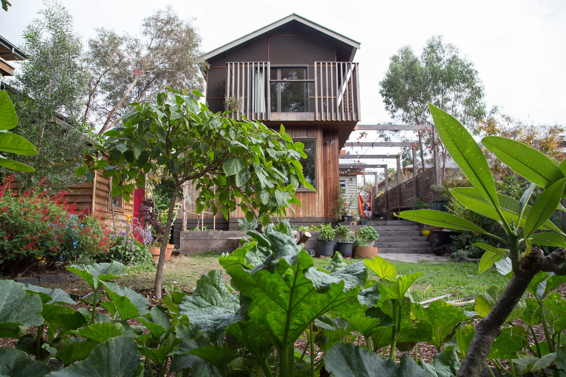
We first visited this 1950's cream brick bungalow on a generous 800sqm block back in 2013 for a sustainable design consultation. At the time the house had an overwhelming list of issues to be resolved, it was in disrepair, dim, dated, and freezing in winter. Most confoundedly, in the 1970's, a self-contained granny-flat had been built only 4 metres from the back of the house. This addition made both buildings feel hemmed in and blocked the home's connection to the generous garden. With a south facing backyard, the home lacked in northern sunlight. To the owner's dismay, the design professionals they had met with so far had lumped it in the 'too hard' basket advising them to demolish both buildings and subdivide the block into townhouses. Such is the fate of many period homes on large parcels of land close to the CBD! The clients loved the deco style charm of the cream brick, and despite the unfortunate configuration, wanted to make the most of the considerable resources contained in two substantial and solid brick buildings with hardwood features.
Our design concept was to turn the problem on its head and make it the solution. We proposed that rather than demolishing the granny-flat and building an extension, we keep the entire footprint of both buildings and consolidate them to create one large, unified, ecologically sustainable home. This design was resourceful both materially and financially by drastically minimising the amount of new build required instead capitalising on the scope of the existing structures. We suggested an approach based on maintaining the charming original features of the principal building and upgrading the rear buildings interiors and thermal envelope extensively so that they read like new spaces. This project required a lot of imagination and a willingness of the owners to do something unconventional. To our delight, they embraced the idea wholeheartedly.
The buildings needed a total reconfiguration, refurbishment and thermally efficient retrofit. During this process, we were able to solve many diverse problems at once. We provided access to all day winter sun to daytime living areas, by placing them in the rear building. The design created a functional layout and abundant visual and physical connection to the garden. We collaborated with building designer Logan Shield to design structural upgrades to replace a substandard lean two passage currently connecting joining the main house and minor dwelling to function as a sitting room and sun trap. A new cathedral roof to the rear building allowed for the addition of north-facing clerestory windows.
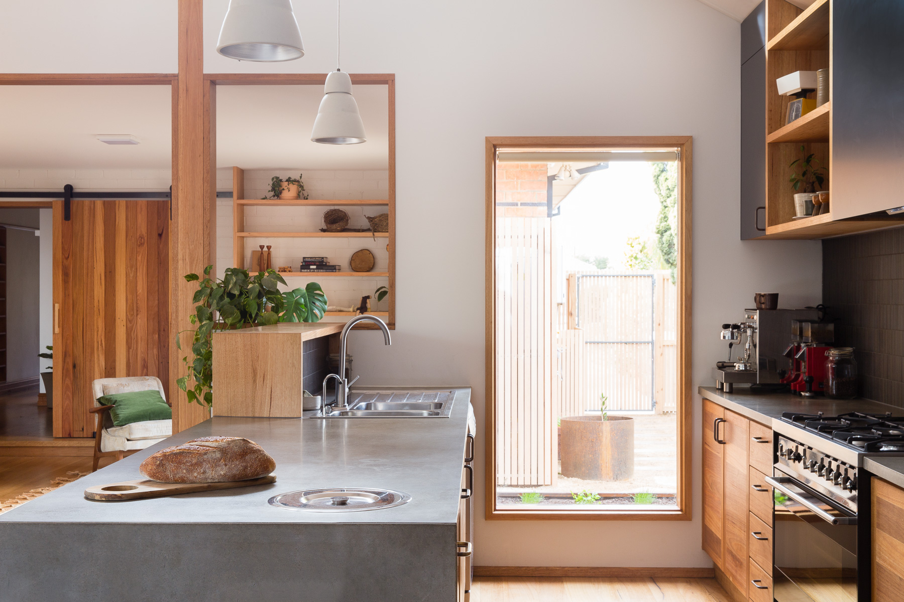
Vintage danish metal pendants were used in the kitchen along with led strip lighting under cabinets. Locally made lights were used by Giffin Design and Anna Charlesworth. Up/ down LED wall-lights were used throughout to allow for ceiling fans.
Creating a visual and practical connection from the residence to the rear garden was prioritised, sliding doors were added to the east courtyard and west decking- making the most of the generous productive gardens. The existing window openings were used to avoid the need for patching of exterior brick-work and the windows upgraded to high performance timber-framed double glazed models. West and south facing windows were reduced and north facing glazing increased. Flexible use of the spaces includes the potential work from home scenarios. Maximising the thermal efficiency of the buildings and upgrading to sustainable technologies involved rainwater tanks, photovoltaic systems and solar hot water. We updated the heating to two zoned efficient space heater systems and added ceiling fans.
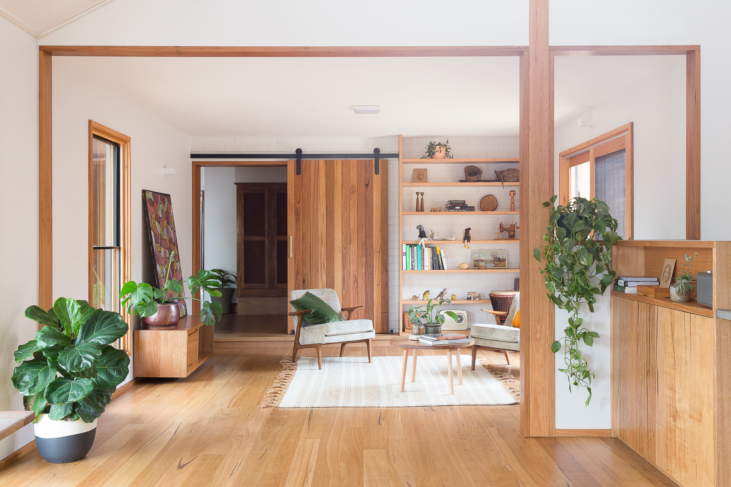
Designed in collaboration with Geometrica, an exceedingly simple timber clad structure formed the new sitting room that would slide in under the eaves and require minimal built alterations to integrate with the existing rooflines. This room opens onto outdoor living spaces to the east and west allowing the owners to follow all day sun and providing cooling ventilation. Early on we envisioned a space for reading and morning coffee and bobby coffee table and pampa rug from Pop and Scott made this space come together.
The new living areas are separated from the rest of the home by a beautiful barn-style blackbutt timber door that was handmade onsite. Providing the heat zone separation, this also slides away when not in use, tucked neatly against the shelving like a feature wall panel.
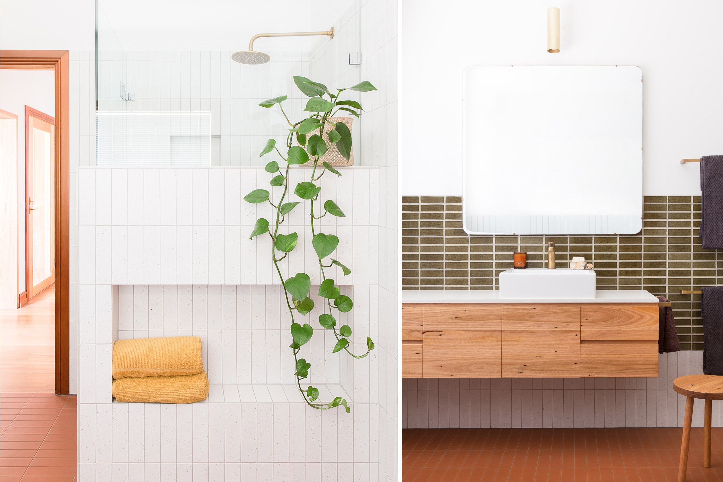
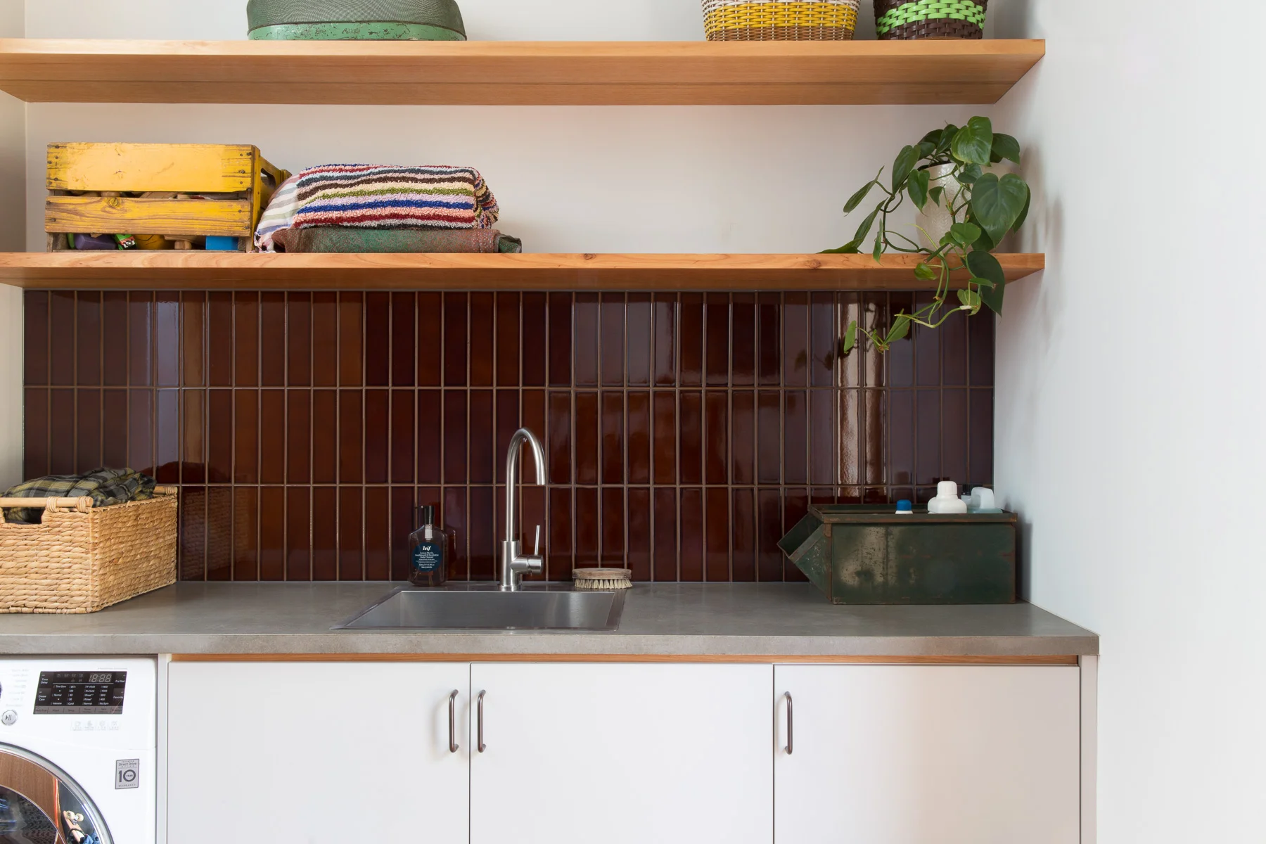
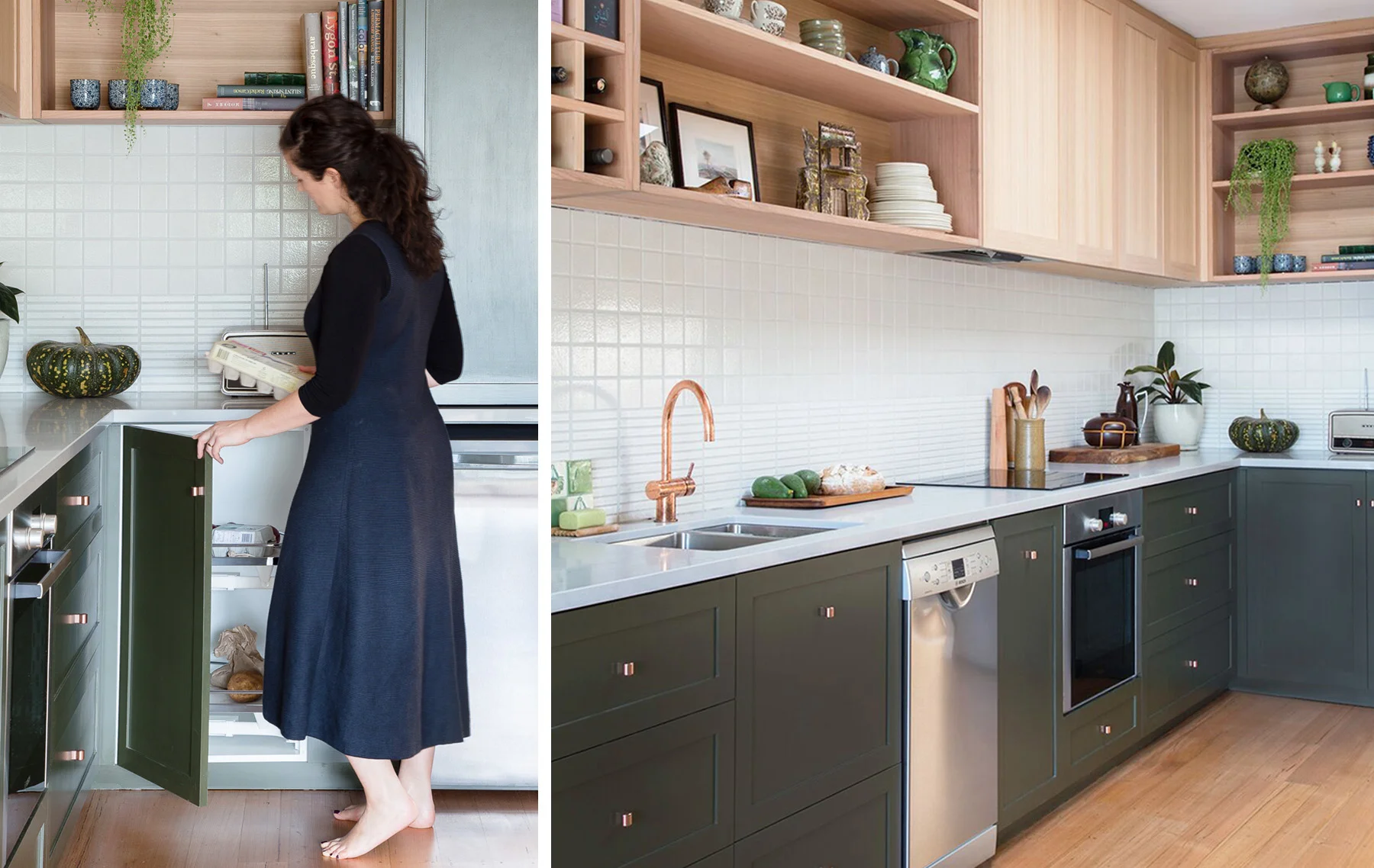
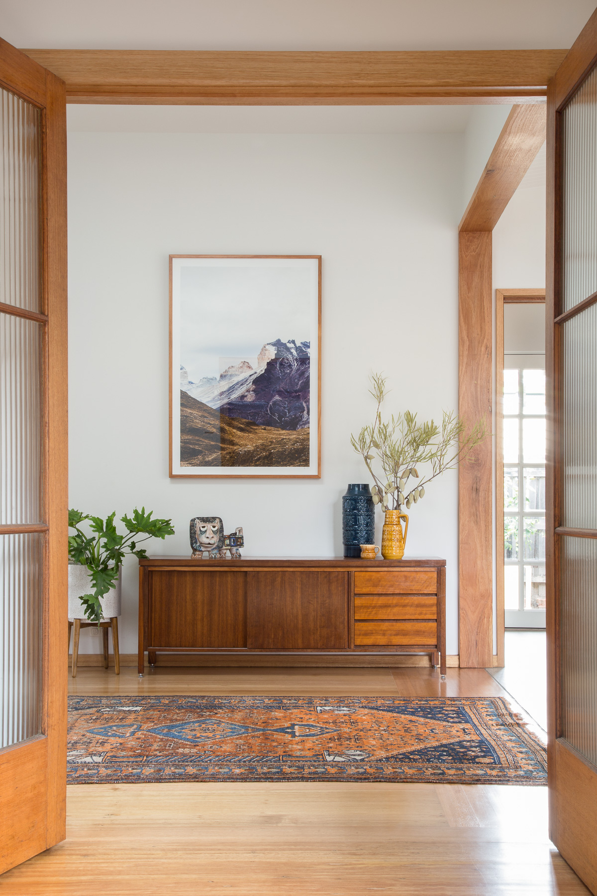
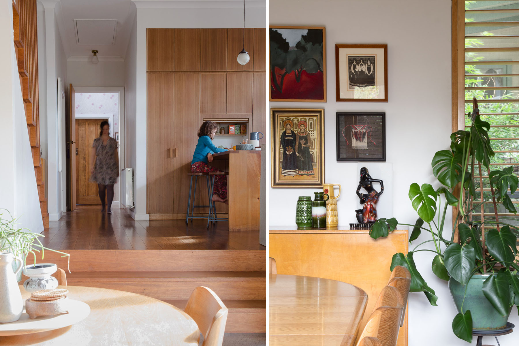
The old granny flat is now unrecognisable- entirely transformed into a warm, light, open plan, living/dining and kitchen plus a new laundry/ mud/ drying room and second bathroom. We carefully selected classically appealing details that do not reproduce the mid-century period style but instead provide a contemporary interpretation of it, building a cohesive relationship between old and new. The existing Australian hardwood detailing (Blackbutt) was continued throughout the new spaces to minimise any jarring transitions. Door and window hardware is consistent in aged brass.
We sourced and repurposed salvaged timber railway lockers and fluted glass doors. A combination of vintage and locally made custom furnishings was used to create a timeless mix of style and form - unified by quality and materiality.
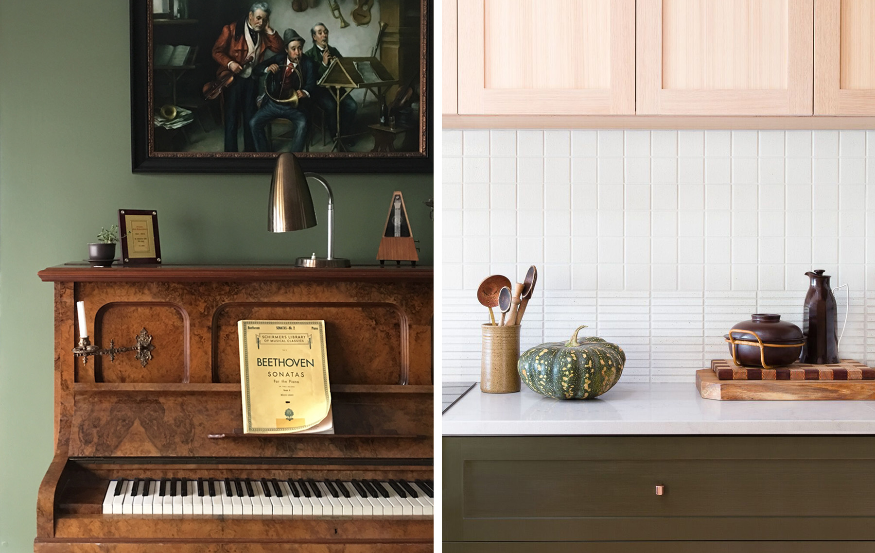
The colour palette draws on earthy deep textures and colours reminiscent of the late mid-century period 1950-1970. A neutral base of white, charcoal, warm blacks and concrete is warmed up with varying shades of warm tones come from timber, terracotta, brass and treacle-coloured tiles. Accents in deep green provide contrast. Surface materials create textural interest, with the existing exterior brick creating a new internal wall, slim plantation timber lining boards to the cathedral ceiling, mosaic tiling, raw terracotta and recycled composite surfaces. We considered durability and practical function in each space with a place for everything and robust surfaces that will age well with use.
All photographs by Emma Byrnes
Digital Feature
Sanctuary Magazine - Granny Flat Upcycle

